Thursday, February 9, 2012

Nokia Lumia 800: the first few days

The Lumia 800, the Windows Phone 7 powered smartphone is finally on sale in Finland. What could I do but to try to get my hands on one and report back my findings and experiences. Overall, I'm quite pleased, although I see that a lot must still improve for these devices to hit home in a big way.

 
I managed to get my hands on a black Lumia 800 with a fun lime soft casing. This was the combination I had in mind already when getting the N9, but never really followed it through. Lime turned out to be a great colour that complimented MetroUI's funky and fresh look, although I was left hoping for a little extra punch. Theming WP7 doesn't really exist (out-of-the-box anyway), as you can really only change the colour of the tiles and turn the black background into white. If you want to have more control over customisation, I suggest you get the N9.


Glad to see emphasis is on the aesthetics (again)

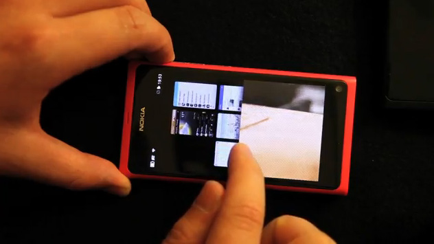
I won't spend any time describing the exterior of the device, as its the tried and trusty N9 casing with an extra camera shutter button and a differently placed hole for the flash. Everything about the physical form of the device raises feelings of respect, complimenting the smoothness of WP7. Perhaps even a little more than the same casing did for MeeGo-Harmattan on the N9. WP7 and the casing are a great fit, and the Lumia 800 joins the N9 in the league of devices that bombard the senses with the most pleasant sensations. Bravo, Nokia. Once again.

Even though the customisation options of the operating system on the Lumia 800 are practically 0, the customisation on the N9 is also debatable. Sure you can do all sorts of things in theory, but in practice most people have aimed to keep the core look and feel of MeeGo-Harmattan untouched. And its easy to understand why: MeeGo-Harmattan is a beautiful experience as it is. Windows Phone 7 succeeds in the same feat. Screen items swush, slide and stack on your screen with no stutters or hickups, and soft sounds of the keyboard pat your eardrums with the most pleasant sounds. As a comparisant I regard my HTC DesireZ's system sounds as too interruptive, loud and all around cheap sounding. I think this is true for all Android devices regardless of manufacturer. Leave it to Nokia to spice the ringtone selection up with some familiar sounds and melodies, although Nokia fared much better in this category in its devices from around 3-4 years ago.

Half-baked cakes all around

When comparing to MeeGo-Harmattan, WP7 feels much more finalised which might not come as a surprise to anyone. Everything is in place, nothing feels like a placeholder and a lot of functionality MeeGo-Harmattan seems to go for is already place here. On board the Lumia 800 Nokia ships the latest version of WP7, Windows Phone Mango which hasn't really changed since Tango as I last saw it on the HTC Trophy. Undoubtedly 99% of the new features took place "under hood", which is to be expected anyway in a system so keen on its UI design guidelines.

Windows Phone 7 is by no means, however complete. Funnily enough some gripes I had about MeeGo-Harmattan also apply here. For example, I complained about not being able to adjust font size in the browser on the N9. That really can't be done here either. The second gripe was the refitting of the text to fit your zoom level. This doesn't exist either in WP7 or MeeGo-Harmattan. Also, I was quite fustrated with constantly twisting and turning the device, as only a few applications and functions supported landscape mode. Relating to this, I found it odd that the landscape keyboard doesn't stretch out to invade as much screen real-estate as it could, but instead crammed itself into the middle of the screen. Why is it like this, Microsoft? Is it a resolution thing?

 WP7 makes a big deal about location awareness as well, but sadly the Lumia 800 doesn't know what's around to drink and eat, but will give you locations (that might be restaurants and bars) that you can check in to. This seems like a halfway implemented idea. For some reason my initial response to this was the feeling of being sold a product that doesn't even have all the features it was sold on. Funny I didn't get this feeling with MeeGo.Other similar nigglets include (but aren't limited to) app availability in my region, lack of control over autocorrect functions and missing voice recognition in my language.

The killer thing about Windows Phone 7 for me still seems to be the integration of Facebook and Twitter services into the system. I also happen to agree, that "having an app for that" has very rapidly become part of the problem instead of the solution on smartphone platforms. Having a separate app for everything on an operating system that doesn't support multitasking is just madness. Its like being given all the keys to a huge house, but instructed to close and lock each door after leaving the room, even if just popping out to the kitchen to get a cup of tea before you continue reading your bedtime book. With these smartphone platforms it just never becomes possible to leave a door open. Windows Phone 7 attempts to address this problem by allowing you to view your friends' Facebook images and status updates in your address book, in addition to the traditional options of calling or texting them. This is my number one favourite feature of WP7. Bravo Microsoft.


The many faces of WP7

So just how well does Windows Phone 7 fare against the competition? This is an incredibly difficult question to answer, as WP7 is aimed at people moving up from "dumbphones" to smartphones. This means that functionality in WP7 will be limited, although time will tell how much functionality the ever growing selection of apps for WP7 will bring. WP7 is also strongly stylised and focuses to achieve so tightly defined goals that I imagine it might appear alien or plain unfriendly for some people.

The Lumia 800 comes packed with two great music apps, that really bring life to the entire device in a whole new way. Using the Lumia 800 can be like a visually appealing music video, pulsating with youth and trendiness. The downside to this is that older users force-switching over from Symbian with business purposes in mind might feel like they're getting the raw end of the deal here. Many business users will have their contacts and other data synced to one cloud service or another, but for those moving up from Nokia's pre-Symbian3 phones will have a tough time. At the time of writing this, you can only transfer contacts to WP7 over bluetooth if you have a S3 device. Nokia Suite doesn't work with WP7, and Zune can't manage your personal info on your phone in any way. I don't understand why Nokia was in such a hurry to announce WP7 partnership, only to ship a device so totally incompatible with any previous Nokia devices. Way to piss off loyal customers I think.

I wouldn't be surprised if the reasons described above explain why operators are so sceptical about WP7's chances: business customers don't care how much their phone bill is, but they have to feel they're getting services worth paying for. New smartphone users are a huge target market, but the amount of confusion related to transferring your data over from previous devices might be too much of a hassle, as operators certainly believe customers will return to them for assistance.


Final thoughts

For me WP7 is an opportunity for hedonism, so I choose to enjoy all the things I can about WP7 and not feel so bad about the shortcomings. I'm also lucky to not be really affected by its downsides, as I have all my data in the cloud, and I'm a bit of a social media junkie. So it caters to my needs quite nicely. Comparing to MeeGo-Harmattan, I feel there's more to do on me on this device. The ability to view desktop versions of websites has a big influence on this aspect. Windows Phone 7 is something new and different, albeit incomplete. If I had to describe WP7 in a word: its fresh. Let's see how long this impression lasts.

WP7 is a good choice if you aren't too business or productivity orientated (note: I haven't tried out Office365 yet). We just need to hope that big men Elop and Ballmer won't give out any more ridiculous statements about their own fails with the platform, blaming sales staff or marketing or what have you for bumps in the road. They are in my view the greatest threat right now to the credibility of the platform.

A great testament of this CEO tomfoolery is Elop's promise of bringing "added Nokia value" to this product, which sadly is exactly 0. There's nothing especially Nokian about the software in this product, and that is a truly sad thing to realise. Although the reinvention of Nokia Music's mix radio brings some comfort. The bottom line remains, however: If you see another manufacturer produce a WP7 device with a better screen, processor or some other factor, go for it. You won't be missing out on anything.

Sadly he king no longer stands on its own two feet -- contrary to Elop's promises.

Monday, February 6, 2012

Asus Zenbook UX21 - First few days with it

My Asus Zenbook UX21 arrived yesterday, and its been a great experience so far. I have little experience with Apple products, but the feel of a premium product is created by numerous details both large and small and you are constantly reminded of them.

The problems mentioned in previews regarding the trackpad have all been fixed in the final commercial product, all you have to do is click "Yes" on first boot-up to apply Asus updates. The second gripe previewers had was with the keyboard and there I can see what they might've been talking about. In contrary to previewer's, I would consider the keyboard to be too stiff rather than have too much flex like often reported. We might be describing the same phenomenon, though, as I too suffer from the occasional letter being left out when typing, just like previewers warned. My biggest problem with the keyboard is the placement of the "Del" and "Power" keys right next to eachother. Luckily a custom Asus dialog screen pops up when you press the power key as to make sure you didn't press the key by accident.

Sound from the speakers is very good. I'd still much rather have headphones connected, but for the occasional video viewing they're really great. I can also listen to music if no headphones are available with comfort.


The "instant on" feature is superb, and now a necessity to me on devices as portable as this. Apple people will be more than familiar with this function: it enables the device to come back from hibernation into usable state in around 2 seconds. Just close the lid, pack it away and forget about it. The device has been designed for this use, and so the battery will last for about a week in this state and should the battery run out it will do a quick backup of everything going on so you won't lose your precious work.


Previewers criticized also the viewing angles especially on this 11.6" Zenbook, but I must say that doesn't matter the least to me. I'm glad that the dude sitting next to me on a train won't be able to just gaze over and see what's on my screen. I don't think anyone watches movies off these things, at least not with friends. The screen could be less glossy, but its not as glossy as my old laptop that actually made using it hard in most situations. So again, I'm very content.

Ideally, I would've wanted to get a netbook with built-in 3G,  but soon noticed that these seem to have gone out of fashion. Finnsh operators still have some models in their selection, but I wasn't in the mood of making a 2-year contract just to get my hands on a 3G-enabled device. Luckily my DesireZ and N9 work fantastically as WiFi hotspots, effectively negating the need for a 3G SIM-slot.

Performance wise the machine is great. I'm a big Starcrat 2 fan, and I'm happy to report that SC2 runs decently on Medium settings applied automatically by the game after hardware inspection. If you want to stay on top of what's happening in the game, you might as well switch to "Pro" graphics settings, which means "Low" settings for those unfamiliar with SC2 progaming. ;) Installation of SC2 is always a 2-4 hour feat, as first you download the installer and then you apply all the updates to the game. Thanks to the solid state drive in the UX21, the game installed in record time, clocking just under 3hrs. This is a good hour faster than on my desktop PC. Bravo.

I have no opinion whether this netbook is a "MacBook Air killer" or anything of the sort, but I feel like I've got pretty much everything I would've wanted from the Air and more: premium feel, premium look, but all the app compatibility I could dream of. Not to mention support for accessories: I depend on no single manufactuer for them, everything proprietary has been compensated by Asus by providing the required dongles with the sales package. When comparing the UX21 to other ultrabooks out there right now, Asus fends distinction for itself by the premium design and manufacturing materials. Other ultrabooks at this moment look like plastic toys compared to this thing, even if they cost almost as much as the Zenbook.

Off to install Jolicloud on this thing.


Links to reviews of the Asus Zenbook UX21: 


Anandtech's in-depth review into Ultrabook technology and how the UX21 fares in this regard: http://www.youtube.com/watch?v=H7YxrWIAVjY

Introduction to the UX21 and a little about the media playback on this device: http://www.youtube.com/watch?v=IwbOzI4u4ew

UltrabookNews' great written review: http://ultrabooknews.com/2011/11/20/asus-zenbook-ux21e-detailed-review

Saturday, October 22, 2011

From the N900 to the N9, a review


Nokia finally started sales of the N9 mid-October of 2011, and I was lucky to get hold of one for a couple of weeks soon thereafter. Here are my views on the device. I'm a N900 enthusiast and someone who might be called a "power user", so bear this in mind. Please leave a comment after reading if you the least bit feel like doing so.


EDIT: fixes to text made based on readers' comments, thanks so much guys! Oct 23rd
EDIT2: A new firmware upgrade has been released for the N9 to be applied OTA. Twitter, Facebook and various other apps have been upgraded & . Therefore info in this article might be outdated. -- 9.11.11.


MeeGo UI:


Let's start with the most interesting, the User Interface. The N9 is quite a different experience to Maemo (or Android for that matter) as it has no "desktop", but a "three views" -system where you see your apps, events and open applications in views adjacent to eachother. A key component in the UI is the swipe gesture, with which you swipe between these views, shoo away open apps and even close them. There are no "X" icons hanging about, just swipe, swipe, swipe.


Perhaps the most dominant of the views is the apps-list, which received some criticism from me as soon as I saw it in a leaked video. I understood that this kind of "app listing" view was deemed obsolete by Marko Ahtisaari in a conference about Nokia's design ideas (Link, thanks "Anonymous"!), but apparently he really only meant that they thought the iPhone home button was the only thing worth changing there. Windows Phone 7 is in this sense more advanced in design-language I think, as the starting page tiles represent a new kind of approach to using your device. Be what it may design-wise, all your apps will add to the app-list view, with no options for making folders or groups. This appears to be coming in the next update. Thanks to a reader for the tip!


The swipe is however very smooth, where you're able to gradually swipe away a playing video or any other app in action, see what's in the view beneath it and then choose to drag the video back to full screen or shoo it away. This is an example of the sheer technical brilliance Nokia has packed this device with. This is an industry first, but something tells me we're going to see more of it. The N9 doesn't run on the very latest hardware, but features like this make Android feel bloated and messy in comparisant to this kind of smooth, immediate performance --on "dated" hardware. Bravo, Nokia! "It's not technology, its what you do with it" applies here.


Software decisions


The experience on the N9 is very good  and the "3 views" style UI works brilliantly. There are no stutters, and even devices running with almost full memory continue to function smoothly (for the most part). However, some of the design decisions on the software side bother me. I never quite feel as in control over my running apps as I do on the N900, because sometimes a same direction swipe means changing between playing songs, viewing pictures or sending the app to the background. Granted, this will only get better and better as you use it more and more, and will probably be refined in software updates to come.


My biggest gripe with the software, however are the native apps and the browser. The Facebook and Twitter apps open a drastically simplified app of what we're all probably used to. Perhaps this is also due to it being an early software version. On the other hand, they're stylistically so simplified, that I can't help but fear that it is part of the design choice and won't be altered. Or in Nokia fashion its "left to the community to fix" but at the same time they're closed source apps. Please correct me if they are in fact open source! Most of the pages in the stock browser open up as mobile websites by default (if someone knows how to tweak this, let me know!) and pages won't let you change to the full site, probably because of the lack of support for Flash. In worst cases sites offer you to change from "Simplified mobile" to "Text based version". Hrrr, 600€ for a text version of Facebook? This reminds me too much of that other product. Granted this could be due to websites not fully recognizing the N9 yet, or a premature browser software version.


Browser king?


To dwell into the browser issue more, the browser experience is perhaps one of the two biggest dissapointments for me about the N9. One big reason to why the N900 is such a timeless device is its browser. Everything is moving towards web apps, so why not perfect a near perfect browser and thus future-proof the phone? The answer to this is probably in switching over to MeeGo's browser that doesn't and probably will not support Flash, and so its basically a completely different browser to MicroB found on the N900. As Anidel points out in the comments, however, technically it is in a sense very advanced, but until sites decide to make full use of it, it leaves a simple impression.


Totally in-line with the rest of the native apps, the browser is missing some basic functionality. For example, clearing your browsing history is not (at least at the moment) possible inside the browser (thanks for correction) the saving or clearing of passwords is not present, and it doesn't even have bookmarks and making bookmarks could be a bit more intuitive. The browser tries to form "tags" around what you've browsed to or searched on the web, which I couldn't find much use for. Also, this tag system is not incredibly accurate either. For some reason my first search for the nearest swimming halls remains huge in the "tags" and I've only done the search once. Unfortunately also the e-mail app is also lacking in some features that people probably expect to be there by default. For me it was OK, though, I get along with the N900's e-mail app just fine, so I'm probably not so needy as some of you guys.


The browser is also suffering from some text-entry box related oddness I remember first spotting in the earliest MeeGo Developer Edition releases. When tapping on a text box, the view zooms too close to it, the virtual keyboard blocks a huge part of the text box plus the text box isn't completely visible. The end result is that you have to type blind. Pinch-zooming will only confuse the browser more. Sites where I saw this happen were Maemo.org and TweetGo.net.


All in all, though, the performance of the applications on the N9 is superb, Nokia Store might not be filled to brim with apps but makes up for it in quality and stutters of Nokias' past is nowhere to be seen here. It seems that first apps in the Nokia Store have really caught on to the design style of Nokia's MeeGo-Harmattan, and together with the phone UI they make up a wonderful experience.


The Achille's heel


The next thing I'm going to rant about will probably not even matter for 90% of people the N9 is aimed for, but its a showstopper for me. I think you've been waiting for this remark all review long: the N9 doesn't have a hardware keyboard. And it Sucks. Nuts.


It sucks Nuts.


I tried and I tried, but a VKB (virtual keyboard) just can't keep up with me and just can't satisfy my needs. A lot of people seem to get on fine with their touch-only text-entry keyboards, but nobody can pull off sending a SMS with more complex contents than "OK" when on the run. Also, I enter a lot of text on my N900, part of this blog entry is written on my N900. The N900 is my main device for reading and replying to e-mail, I Twitter more on my N900 than on my desktop, and I use IM more on my N900 than on my desktop PC. And I'm also a kind of a blabbermouth of a guy. So it simply infuriates me when a device forces me to get down on my knees and only send "OK" messages around to my friends if I don't have 5-10mins to stop and tap in letters for a message. Swype should be making an appearance in the first software update to the N9. Sadly I doubt that it will allow me to write messages on the run any better.


One thing I must make clear though: the N9's virtual keyboard is NOT a bad virtual keyboard. Nokia's keyboards on Symbian³ are terrible. They're rubbish. The virtual keyboard on the N9 is, ironically, in my view one of the most aesthetically pleasing aspects about the device. The keyboard click sound, combined with the haptic feedback and beautiful screen makes for a wonderful experience. It is the most pleasurable virtual keyboard out there and is perhaps the crucial feature about this device that gives it its premium feel. Expect this to be imitated in competitors' devices.


N9 & the competition


Since the launch of the iPhone Nokia's devices have all been pitted against the iPhone, regardless if these devices have actually targeted the same audience. The N9 however (finally) has an air about it that makes it seem as if it aims to take on the iPhone. This is noticeable from the wy the N9 focuses heavily on user experience, in the good and the bad. 


It seems the N9 was designed with the rule-of-thumb to favour user experience over functionality. INo think this explains the rudimentariness of the stock apps. My guess is functionality is missing in fear of cluttering up the UI. 


The N9 also seems to carry a bit of a grudge over from experiences with people and media criticising the landscape-only orientation of the N900. The N9 strikes back by allowing portrait mode everywhere, but sadly it over-compensates just a little bit. Most of the stock apps, such as the mentioned Facebook and Twitter apps don't rotate to landscape orientation --at all. Not even when you're inserting text. So the portrait qwerty is all you get. Trying to work around this problem is browsing to the website, but then you have to face the shortcomings of the browser.


In general I think the main guideline for the experience was the iPhone, at least in mentality: everything must look good, but there's no way to get to the nitty-gritty and no customizability. This made me feel at times like I'd been thrown back to 2007. On the other hand however, using the N9 is aesthetically an incredibly pleasant experience. The way it feels in your hand, the sounds and graphics add up to a very pristine and classy experience. Not to mention the effect of the VKB. 


Compared to the N9, the iPhone feels like a lifeless and cold slab of metal and glass that you tap and pat. That's it. The N9 responds to every tap, connects with your natural way of doing things, and constantly rewards you for using the device. There's no eye-candy here per se, just grace and intuitiveness. So yeah, the N9 is a better phone than the iPhone.


Final comments


The N9 exceeds in everything it sets out to accomplish and even beats the competition in their own game, so you can't really say its a bad device. What's important to realize here is, that the N9 is in no way a successor of the N900, even if its initial efforts might've been to that direction. The mobile Linux enthusiast is better off somewhere else (but where?).


The N9 led me to realise that there are now two manufacturers in the game that know how to combine what you feel in your hands with what you hear and see to form a comprehensive, wholesome aesthetic experience. And in this sense, the Nokia N9 manages to surpass the iPhone by a hundred miles. It's great to be able to say this about a Nokia device. 


The N9 might not ever have the apps the iPhone has, but all in all at this time, the Nokia N9 is a better device than the iPhone for that crowd that appreciates the iPhone to begin with. If, however you are looking for something along the lines of the N900, the N9 isn't the device for you. If you decide to go for the N9 anyway, many familiar Maemo apps are available in the Nokia Store, such as: Filebox, Twimgo and gPodder.


There's a software update coming to the N9 from Nokia soon, so a lot of what I ranted about might be changed. I try to remind myself also of the fact, that the N9 runs on MeeGo and I know there's a hacker community around this device that will let the rest of us in on tweaking the insides of this device. For me personally though, no amount of modifying the N9 will bring me a hardware keyboard. Without a hardware keyboard, I feel the N9 is only holding me back, not setting me free.


R.I.P.


Do you agree/disagree? Please leave a comment below.


Thanks for reading,
Chris